Form Variables
The format for creating a form variable is the following: $var. After creating a form variable Kvery automatically creates a form under the SQL editor field to allow users to customize their variable.
This form has adaptive input fields based on the type of variable the user chooses. In the following part we will provide you with the most common examples of different types of form variables.
The fields that are most commonly part of the variable form are the following:
-
Name
(Input Field)- The 'Name' field is where you give your form variable a unique identifier. It's important to use meaningful names that reflect the variable's purpose, making your queries easier to understand and maintain.
-
Type
(Input Field)Here, you specify the data type of the variable. Types include:- Text: Useful for short, free-form input like names or titles, offering straightforward data entry.
- Text Area: Ideal for longer, multiline text such as descriptions or comments, providing ample space for detailed input.
- Number: Essential for numerical data entry, ensuring only numeric values are entered and supporting mathematical operations.
- Email: Validates that the input is a valid email format, crucial for collecting contact information.
- Password: Masks input for privacy and security, key for entering sensitive information like passwords.
- Tel: Tailored for telephone number entries, often including format validation for better data consistency.
- URL: Validates and ensures that the entered text is a proper web address, useful for linking to external resources.
- Color: Offers a color picker for easy selection of colors, beneficial for settings requiring color choices.
- Checkbox: Ideal for binary choices (yes/no), allowing for simple toggling options in forms.
- Radio: Perfect for choosing one option from a set, ensuring that only one selection is made.
- Select: Provides a dropdown list of options, useful when the input must be restricted to predefined choices.
- Date: Enables users to easily input dates through a calendar interface, ensuring correct date format.
- Time: Facilitates time entry, often through a time picker, useful for scheduling or time-specific data.
- Date and Time: Combines date and time entry in one, critical for events or activities requiring both date and time specifications.
- Link: Allows embedding hyperlinks, useful for directing users to additional resources or related web pages.
- Label: Displays static text, such as instructions or descriptions, enhancing form clarity and user guidance.
-
Width
(Input Field)- Layout Control: This option enables you to set the width of the input field for the variable on the form, using the Bootstrap grid system. The screen is segmented into 12 equal sections, allowing you to specify the input field's width in terms of the number of columns it occupies.
- User Interface Design: Adjusting the width helps ensure the form variable aligns well with the overall design of the user interface.
-
Hidden?
(Tickbox)- Visibility Control: When ticked, this option hides the variable from the user's view. It's useful for variables that should not be directly modified by the user but are essential for the query's operation.
- Background Processing: Hidden variables can store and process data in the background, influencing query results without user intervention.
-
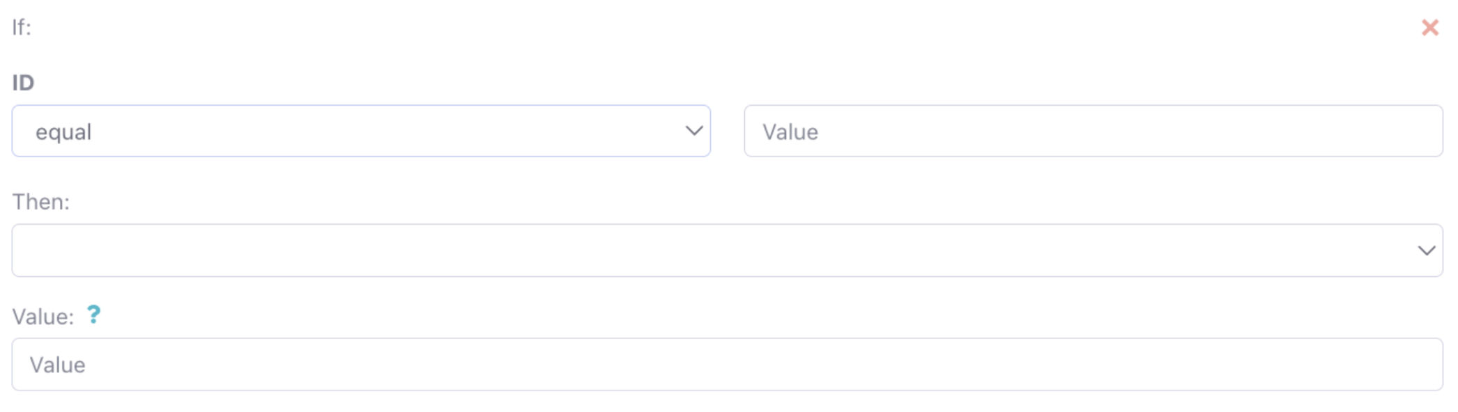
Events Enabled?
(Tickbox)
-
Interactivity: Enabling events allows the form variable to trigger actions or updates in other parts of the form or query based on user interaction.
-
Dynamic Forms: This is particularly useful for creating dynamic forms where the input in one field affects the options or values in another.
-
Options are the following:
- equal
- smaller, than
- bigger, than
- smaller or equal, than
- bigger or equal, than
- not equal,
- partially contain
- not contain
- fully contain
-
Automatically Apply the Value When It Changes?
(Tickbox)- Real-time Updates: This option ensures that any change in the variable's value is instantly applied or reflected in the query results.
- User Convenience: It enhances user experience by providing immediate feedback or results based on their input, without requiring manual submission.
-
Placeholder
(Input Field)- Guidance for Users: A placeholder provides a hint or example value for the form variable, guiding users on what type of input is expected.
- UI Clarity: It improves form usability, especially when the purpose of the field might not be immediately obvious.
-
Default Value
(Input Field)- Pre-filled Input: This field allows you to set a default value for the form variable, which appears when the form is first loaded.
- Efficiency and User Experience: A default value can speed up the data entry process, particularly in forms where certain values are commonly used.
-
Hint
(Input Field)- Additional Information: Provides extra context or instructions for the user on how to fill out the form variable.
- Enhanced Usability: Especially useful for complex forms, a hint can improve the accuracy of the data entered by users.
-
Required?
(Tickbox)- Mandatory Fields: If ticked, it makes the form variable a required field, meaning the user cannot submit the form without filling out this field.
- Data Integrity: Ensures that essential data for the query is always provided, maintaining the integrity of the results.
-
Readonly?
(Tickbox)- Input Restriction: When enabled, this option prevents users from modifying the value of the form variable, allowing it to be displayed but not edited.