Doughnut Chart
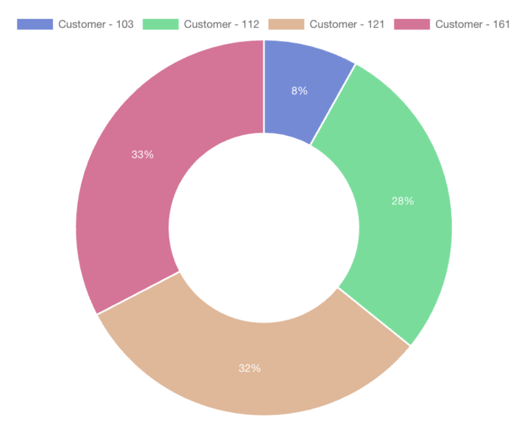
Doughnut charts are similar to pie charts but with a central hole, offering a modern twist on the traditional pie chart format. They are effective for showing data composition.
Structure
Doughnut charts display data in a ring shape, with each ring segment representing a category and its size indicating the value.
Data Representation
Like pie charts, the entire ring signifies the total data set, with each segment showing the part-to-whole relationship. They can display multiple series of data simultaneously, providing a more detailed view of the dataset.
Customization Options
Similar to other charts, with options to change line colors, add labels, decide whether the lines are stacked, and choose the datasets.