Radar Chart
Radar charts, also known as spider or polar charts, are a unique way to display multivariate data in the form of a two-dimensional chart of three or more quantitative variables represented on axes starting from the same point.
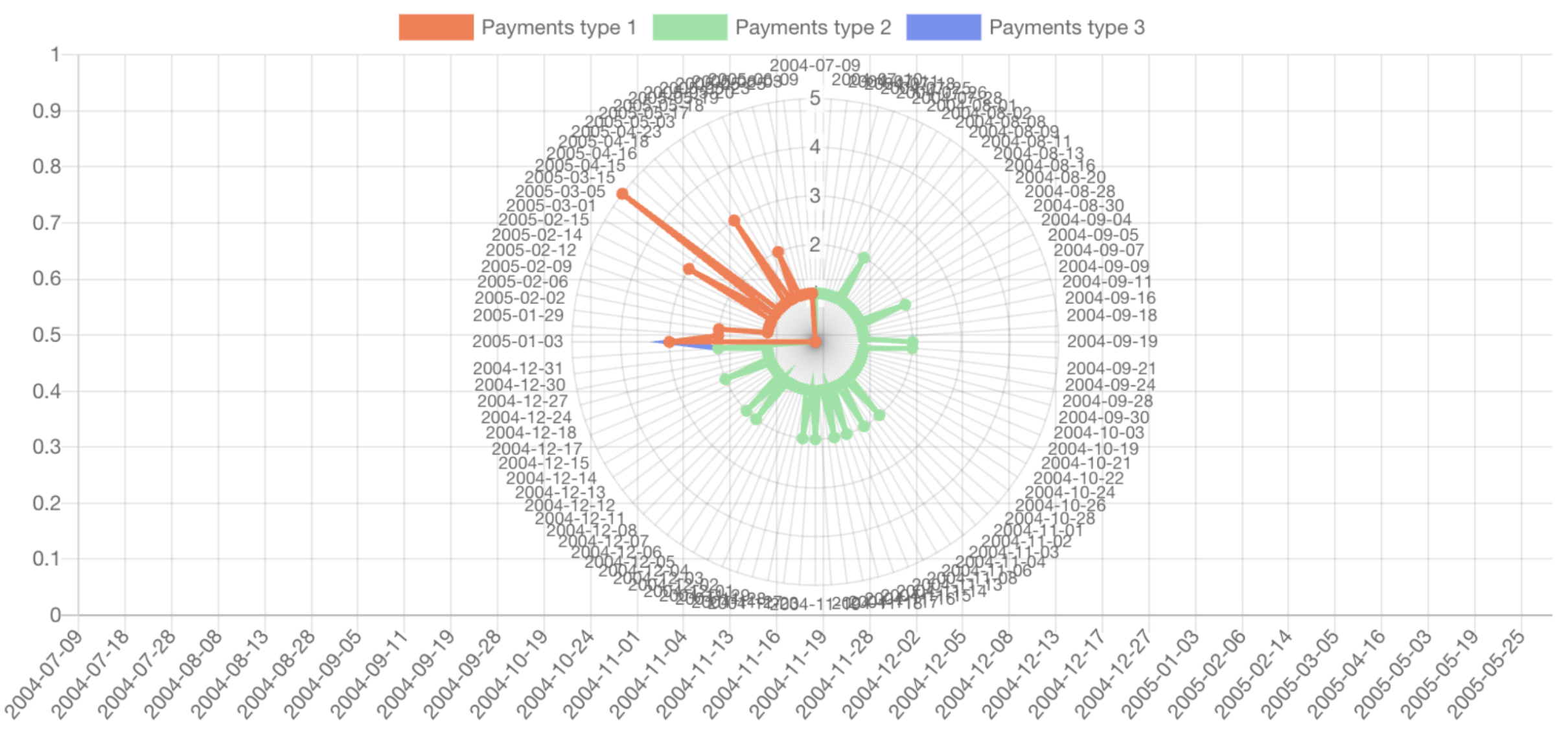
Description and Usage: In a radar chart, each variable is represented on a separate axis that radiates from the center and ends at the outer circle. The length of each axis is proportional to the maximum value of the variable it represents.
Data Representation
Points are plotted on each axis corresponding to the data values, and these points are then connected by a line or a filled curve, forming a shape.
Customization Options
Similar to other charts, with options to change colors, add labels, and choose the datasets.
Radar charts are particularly useful for comparing multiple subjects or data sets across a range of variables. Ideal for visualizing performance metrics across different areas, like skill assessments, product comparisons, or operational efficiency.