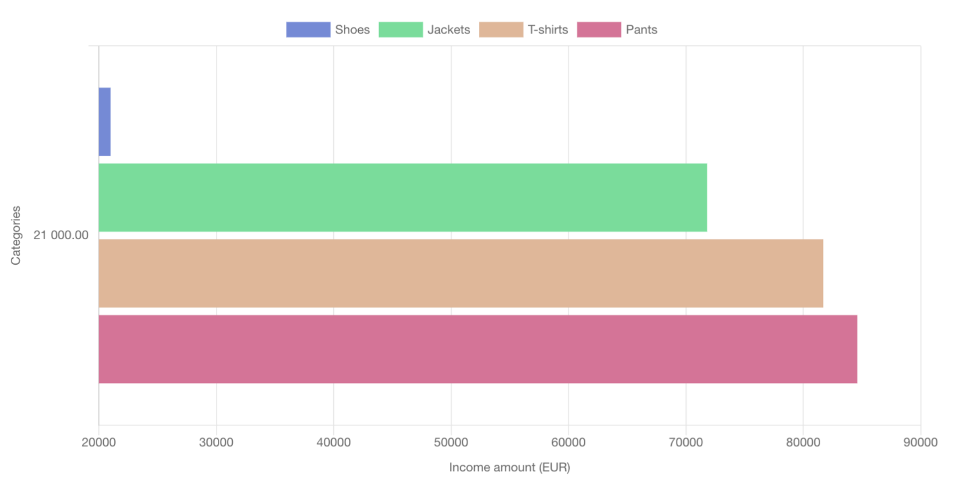
Horizontal Bar Chart
Horizontal bar charts display data using horizontal bars. The length of each bar is proportional to the value it represents.
Usage
Suitable for comparing quantities among different categories. Often used when category names are long or there are many categories to compare.
Customization Options
Similar to vertical charts, with options to change bar colors, add labels, decide whether the bars are stacked, and choose the datasets.
tip
- You can see the detailed data on mouse hover.
- You have the possibility to hide specific datasets by clicking on the colors above the graph.